UX Best Practices for Web3 - Transaction States
Web3. NFTs. The Metaverse. Whatever you would like to call them, the future is here. At Tanooki, we support the advancements these new technologies bring as adoption rises. However with new tech comes new responsibilities, especially in design. Let's dive in.
First, it’s worth noting that this isn’t a true ‘sea change’, as designing for Web3 leverages many user interface (UI) and user experience (UX) best practices that were honed by Web2 over the last couple of decades. However, the blockchain adds new elements, user interactions, and data concerns that designers must consider. Here’s why.
In Web2 applications, most interactions involve making calls to a centralized backend that almost instantly executes some server code to retrieve and/or update data in a database. People are used to this near-instantaneous response, so anything taking longer than a second to respond is considered a bad user experience.
Alternatively, this response time is much slower in Web3, because in Web3 transactions are sent to either execute code and/or update data on the blockchain. And depending upon the blockchain’s characteristics, network activity, a transaction’s complexity, and other factors, it could take minutes, hours, or days to complete a transaction. So to combat any anticipated user impatience, as this feels very different from what people have learned to expect, it’s important for a designer to consider the response time variability to create a great user experience.
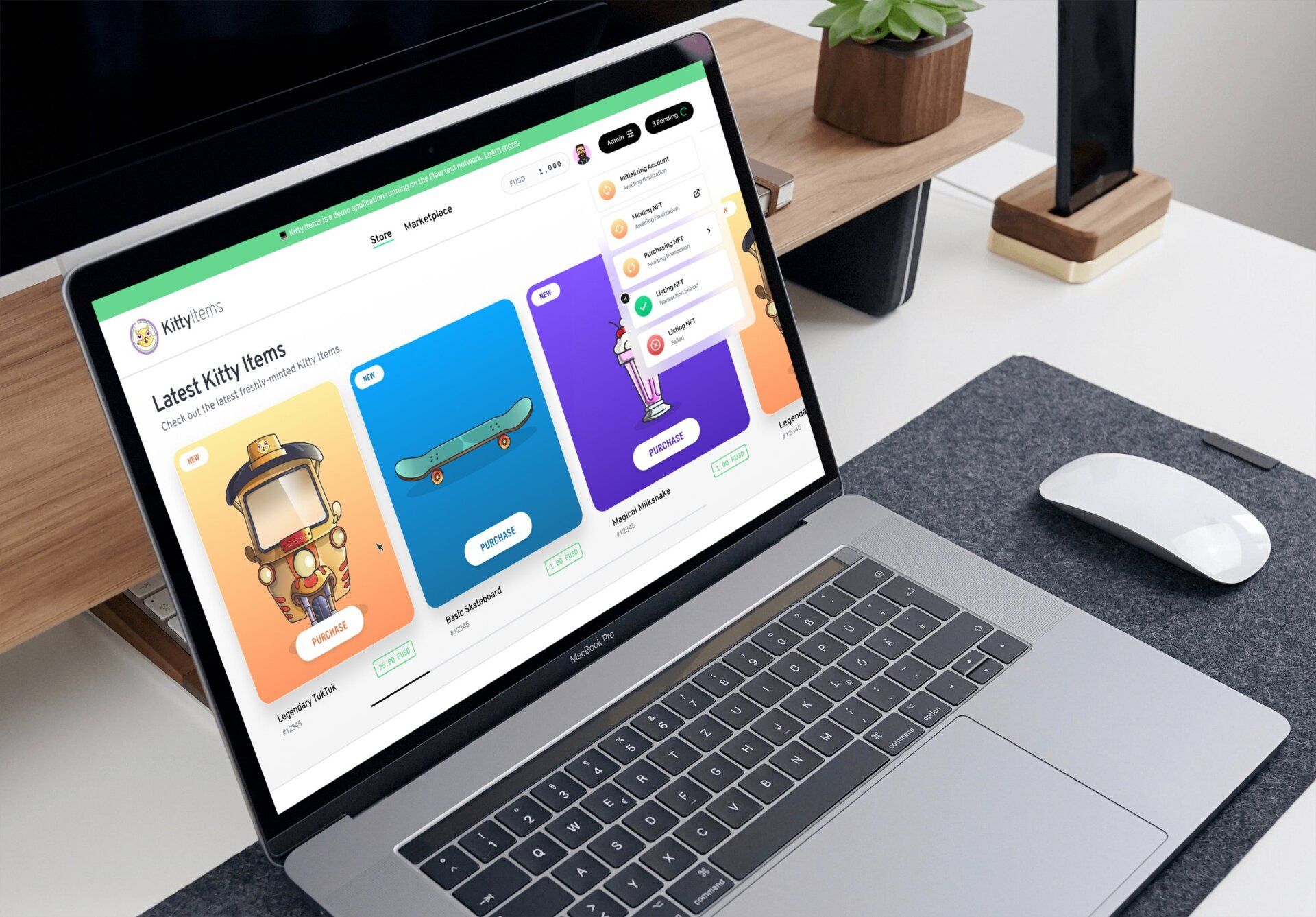
This was front of mind for the Tanooki team when we worked with Dapper labs to create the marketplace reference application, KittyItems. We understood the need to show the latest UI / UX and development best practices for building on the Flow blockchain as part of our remit, and we made sure to think in terms of the potential quantity of pending transactions and transaction completion time. This allowed us to optimize the users’ experience by setting expectations and keeping them informed.
Visual Cues = Better UX
One way to ensure people understand any necessary waiting times in Web3 apps is to provide visual cues within the design. Depending upon the complexity and number of transactions, this can range from utilizing time-tested elements like a spinning wheel to indicate that there is action on the back-end, to a customized progress bar. Here are a few different ways that we’ve approached this:
A SINGLE FAST TRANSACTION
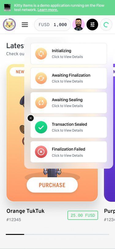
The most basic user flow for any decentralized app (often referred to as ‘dapp’) experience is when a user initiates a single transaction and waits for the transaction to complete before leaving the page. This is a realistic user experience depending upon the value of the transaction and how long it takes to complete.
Most Flow transactions execute very quickly, so we can expect users to only have to wait a few seconds for an important transaction to finish and the UI to update in response. Since the response time is similar to interacting with a centralized service, we can use a traditional spinner to indicate that the request will complete soon. However, another benefit of working with Flow is that the Flow Client Library (FCL) allows our front-end code to easily monitor the status of a transaction utilizing Flow’s events.
In the case of KittyItems, this applies when minting, purchasing or selling an NFT and we chose to show the status of transactions, especially since this is a reference app intended to teach developers about Flow’s capabilities. But in a real marketplace with non-technical users, the project team might give a friendlier name to these statuses or use them to update a progress bar.
ONE OR MORE SLOW TRANSACTIONS
Of course, complex transactions can take additional time to complete, even on blockchains as fast as Flow. There are also use cases where users might fire off multiple transactions within a short amount of time. In circumstances like these, we can expect a user to continue navigating around the site while one or more transactions are pending. Ideally, users also get notified when these pending transactions complete.
To enable this experience, we leveraged a notifications status element that appears when transactions are pending and allows the user to slide a “drawer” from the right to view the recent transactions.
Using this ‘card-like’ approach has a number of UX benefits, including:
- Encourages the user to continue engaging with the product
- Indicates whether any or all of the transactions completed
- Only takes up a small amount of screen real estate
- Informs the user of the status of specific recent transactions
- Allows the user to get more detail about any transaction by clicking through to Flowscan, the Flow block explorer
…and more. It also works well on mobile devices, further expanding the UX benefits.
As Web3 continues to expand and dapps become more proliferated, we expect to see additional design innovations that put the user’s experience front and center.
Contact Us